GRAPHIC
Food Typography Poster Prompt — Make Food Interact with Your Headline
A template-style prompt for bold food advertising: the dish physically weaves through, refracts, or reshapes the headline type on a warm editorial canvas — with placeholders for your brand, product, colors and copy.
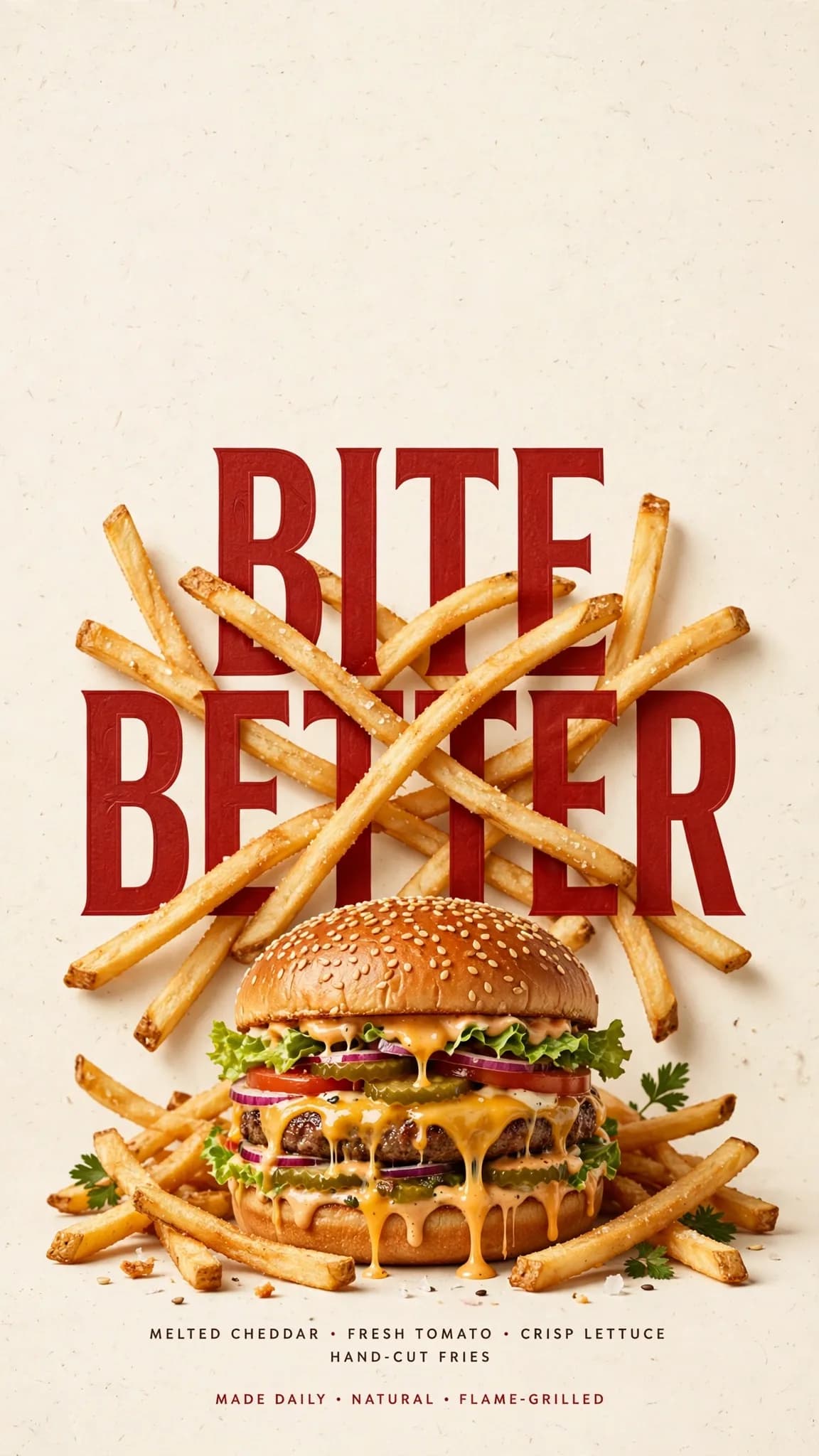
Illustrative visual reference · not a verified generated result
The Prompt
Copy the prompt text below and adapt the parameters to fit your vision.
PROMPT TEXTVerified prompt instructions
Inputs: [BRAND] = brand name · [FOOD/DRINK] = hero product · [HEADLINE] = main word or short title · [INTERACTION] = how food meets type · [ACCENT COLOR] = typographic accent · [DETAILS] = supporting copy.
Create a 9:16 vertical food editorial poster fusing hyper-realistic food photography with bold expressive typography.
Canvas: warm cream or ivory paper background with subtle natural texture. Render the food or drink realistic, appetizing and materially believable — natural highlights, shadows, texture, true proportions. No CGI look, no plastic surfaces, no floating cutouts, no over-polished commercial rendering.
Core concept: the food must physically interact with the typography per [INTERACTION] — never just sit beside the text.
- "Weave through type": let continuous food elements pass naturally in front of and behind large letters, with convincing depth.
- "Refract type": place transparent glass or liquid over the headline so the letters seen through it bend, magnify or distort through real optical refraction.
- "Create negative space": let the food's shape — or a missing portion of it — open a clean empty zone where the headline settles naturally.
- "Replace a letter": build one recognizable letter of the headline out of the food itself, keeping the full word instantly readable.
Typography: make [HEADLINE] one of the strongest visual elements in bold editorial type. Fuse type and food into one composition — clear hierarchy, generous negative space, intentional cropping.
Copy: only a few useful brand details — [BRAND], ingredients, flavor notes, opening hours or address via [DETAILS]. Keep every line short and meaningful.
Palette: [ACCENT COLOR] as the main typographic accent, grounded by cream, natural food tones and dark neutrals. Keep it controlled.
Avoid: numbered labels, 01/02, "Vol.", sparkles, generic filler copy, unnecessary decoration, UI-style cards, template-like layouts.
 ChatGPT