
Why AI Logos Usually Look Amateur
"Design a logo for a coffee brand" produces clip art because it is a clip-art brief. Professional logos are the endpoint of a brand system: a brief, a mark concept, typography, color, and lockup rules. The model cannot invent that system from three words — so the workflow is to prompt the system into existence first, then generate marks inside it. Five deliberate stages beat one vague request every time.
Stage 1: Write the Brand Brief First
Before any image generation, use a text prompt to define the brand: name, industry, audience, personality adjectives (not "modern" — pick three precise ones like "quiet, precise, warm"), competitors to differentiate from, and where the logo must work (app icon, packaging, signage). This brief becomes the shared context pasted into every later logo prompt.
Write a one-paragraph brand identity brief for a logo design: brand name 'Ember & Oak', a specialty coffee roastery for design-conscious home brewers. Personality: warm, artisanal, quietly premium. Must work as a coffee bag label, an app icon, and a storefront sign. List: 3 mark concepts to explore, a 3-color palette with hex codes, and typography direction (serif vs sans, and why).
Stage 2: Generate Mark Concepts, Not Final Logos
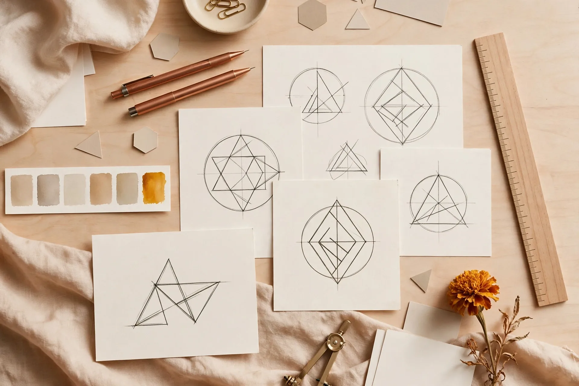
Ask for exploration, not perfection: multiple distinct mark directions on one artboard. Image models do divergent thinking well when you demand variety explicitly — style families, not variations of one idea.
Logo concept exploration sheet for 'Ember & Oak' coffee roastery: 6 distinct black-and-white logo marks in a 2x3 grid on a clean white background — (1) minimalist flame-ember icon, (2) oak leaf line mark, (3) monogram 'E&O', (4) coffee cup negative space, (5) geometric badge, (6) abstract ember dot pattern. Flat vector style, no gradients, no text except the monogram. Professional brand identity presentation.
- Judge concepts on three things only: distinctiveness at a glance, simplicity (works at 16px favicon size?), and fit with the brief's personality words
- Ignore color and polish at this stage — both get fixed later
- Pick 1–2 directions maximum to refine; kill the rest
Stage 3: Refine With Typography and Color
Once a mark direction wins, generate lockups: mark + wordmark together. Specify the typography explicitly — models render short brand names far more reliably than sentences, so keep the wordmark to the brand name only and describe the type style ("refined geometric sans-serif, wide letter-spacing, all caps" or "warm editorial serif, sentence case").
Final logo lockup for 'Ember & Oak' coffee roastery: the oak-leaf line mark from the concept sheet above a refined serif wordmark reading 'Ember & Oak' in sentence case, letterspaced tagline 'SPECIALTY ROASTERY' beneath in small caps. Color palette: deep espresso brown #2B1D16, burnt amber #C96F2E, cream #F5EFE6. Flat vector logo, centered on cream background, generous whitespace, professional brand guidelines presentation.
Stage 4: Build the Mini Brand System
A logo is not a brand until it survives contact with reality. Generate the supporting pieces from the same brief so they stay coherent: app icon version, monochrome one-color version, packaging mockup, and a simple brand board showing mark, palette swatches and typography together. Same brief text in every prompt is what keeps the system visually related.
| Asset | Prompt focus | What to check |
|---|---|---|
| Primary lockup | Mark + wordmark + tagline, brand colors | Legibility, balance, spacing |
| App icon | Mark only, simplified, rounded-square container | Reads at 48px |
| One-color version | Pure black (and reversed white) | Works in single color for print/stamps |
| Packaging mockup | Lockup on coffee bag / box, brand palette | Real-world feel, hierarchy |
| Brand board | Mark, palette swatches, type samples, 2 mockups | Everything feels like one brand |
“A mark that needs color or gradients to look good is a weak mark. If it reads clearly in pure black on white at thumbnail size, the design is sound.”
The Reusable Workflow Checklist
- Write the brand brief as text first — name, audience, three precise personality words, hex palette, usage contexts
- Generate a 6-concept black-and-white exploration sheet; judge on distinctiveness, simplicity, brief fit
- Refine 1–2 winners into lockups with explicit typography direction; keep AI text large and verify every letter
- Produce the mini system: app icon, one-color versions, packaging mockup, brand board
- Re-typeset final wordmarks in a design tool — never ship AI-rendered small text
Frequently Asked Questions
Can AI really design a professional logo?
It can generate strong design directions and concept explorations very fast, but treat the output as a starting point. Professional practice still means a human picks the direction, fixes typography in a design tool, and checks originality — AI accelerates the process, it doesn't replace the designer's judgment.
Why do my AI logos have misspelled text?
Image models render text as shapes, not characters, so longer or unusual strings garble. Keep wordmarks to the short brand name, generate at large size, and always re-typeset the final text in Figma or Illustrator. Never ship AI-rendered small text like taglines.
Should I generate logos in color or black and white?
Black and white first. If the mark works in pure black on white at favicon size, the structure is sound — color is decoration added later. Starting in color hides weak shapes behind pretty gradients.
How do I keep multiple logo assets consistent?
Paste the same brand brief (name, personality words, hex palette, mark description) into every generation prompt, and generate variations as edits of the winning concept rather than fresh generations. Consistency comes from repeating the same description, not from the model remembering.
Is it safe to use an AI-generated logo commercially?
Check the image model's terms for commercial use, and run an originality check — AI marks can unintentionally resemble existing logos. For a real business, a trademark search before launch is wise regardless of how the logo was made.
Related Prompts
Luxury AI Startup Brand Board Prompt — Four-Panel Identity Showcase
ChatGPT
Luxury Brand Monogram Poster Prompt — Sculptural Letterform with Interior
ChatGPT
Conceptual Packaging Design Prompt — One Truth, One Clever Pack Idea
ChatGPT