Packaging is 3D, not a flat label
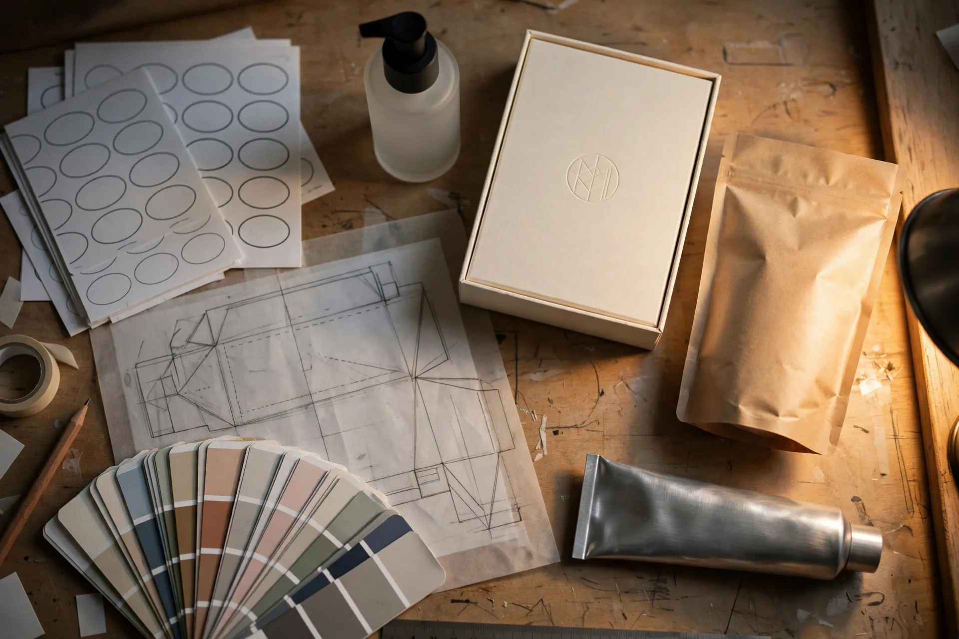
The biggest beginner mistake is prompting packaging like a poster. Real packaging has structure (box, bottle, pouch, tube), materials (matte cardboard, frosted glass, metallic foil), a label hierarchy (brand, product name, variant, claims, net weight), and a finish (embossing, spot UV, foil stamp). Describe all four layers or the model will invent a flat, unmanufacturable fantasy.
The 4 layers of a packaging prompt
- Structure: "tall rigid box", "amber glass bottle with black pump", "stand-up pouch with resealable zipper"
- Material + finish: "matte kraft cardboard", "frosted glass", "soft-touch laminate with gold foil logo"
- Label hierarchy: brand mark largest, then product name, then variant and claims, small net-weight line
- Scene: studio product shot, shelf lineup, or in-hand lifestyle
Format formulas that sell
| Format | Structure prompt | Finish prompt | Best scene |
|---|---|---|---|
| Rigid box (cosmetics) | tall rigid box with magnetic lid | soft-touch matte laminate, embossed logo | 3/4 studio shot on seamless background |
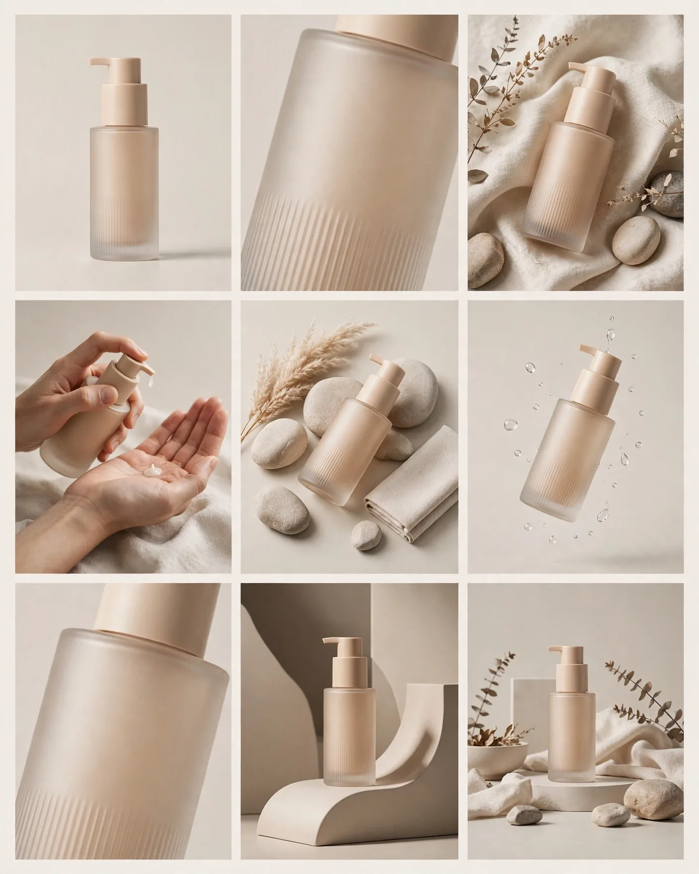
| Glass bottle (skincare) | frosted glass bottle, black pump dispenser | minimal white label, thin sans-serif | bathroom shelf lineup, morning light |
| Stand-up pouch (snacks) | kraft stand-up pouch, resealable zipper, hang hole | bold matte print, window showing product | held in hand, kitchen background |
| Tube (beauty) | aluminum squeeze tube, flip cap | metallic gradient print | flat-lay with ingredients |
Label text: keep it minimal in the prompt
Like posters, packaging prompts should minimize rendered text: brand name + one product word, maximum. Everything else (ingredients, claims, barcodes, net weight) gets added in a design tool. Prompt "clean minimal label with placeholder text areas" to keep the layout honest without gibberish microcopy.
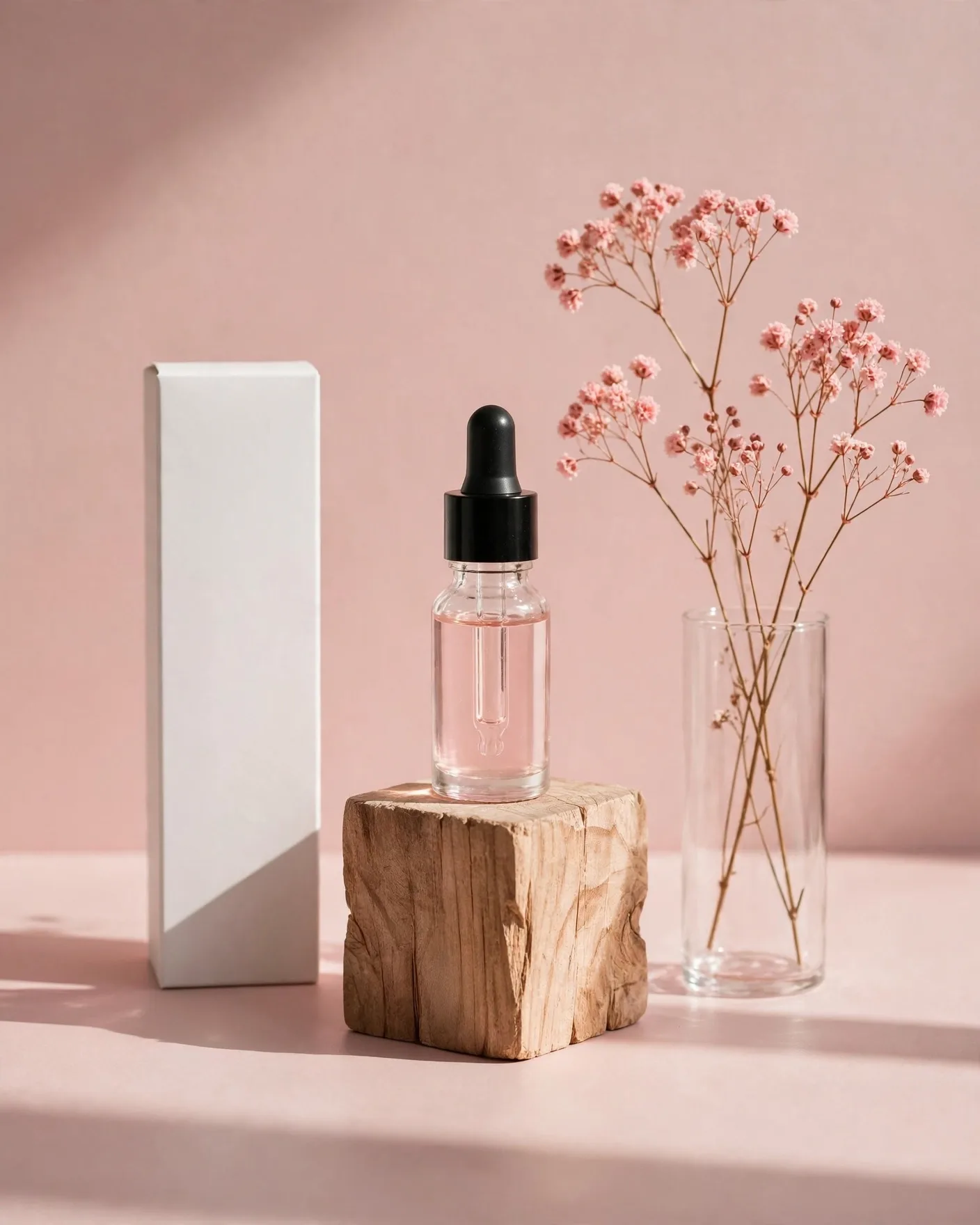
Premium skincare packaging concept, original brand: tall frosted-glass serum bottle with matte black pump dispenser beside its rigid box, soft-touch matte cream cardboard box with embossed minimal logo, clean white label with single brand wordmark and one product word, thin elegant sans-serif, small placeholder text lines, gold foil accent stripe, studio product photography on warm beige seamless background, soft directional light, gentle shadow, 3/4 angle, ultra-detailed, no readable small text.
Frequently Asked Questions
Can AI generate a real dieline?
No — AI image models generate pictures, not cut-and-fold templates. Use the AI render for concept approval and client buy-in, then build the actual dieline with measurements in Illustrator, ArtiosCAD, or your printer's template.
How do I avoid gibberish text on labels?
Limit in-prompt text to the brand name and one product word. Add "placeholder text areas" or "no readable small text" to the prompt, then typeset all real copy in a design tool where you control the fonts.
What scene sells packaging best?
Three proven setups: the 3/4 studio shot on seamless (ecommerce), the shelf lineup (retail context), and the in-hand lifestyle shot (social). Prompt each separately — one scene per generation.
Which materials render most realistically?
Matte cardboard, frosted glass, kraft paper, and brushed metal render reliably. Transparent plastics and complex foil holograms are harder — describe them simply ("subtle holographic sheen") rather than in technical detail.
How do I keep a packaging line consistent?
Lock a style block and repeat it verbatim across variants: same material, finish, label layout, lighting, and background — changing only the variant word and accent color. Consistency comes from repetition, not luck.