

Why text is the hard part
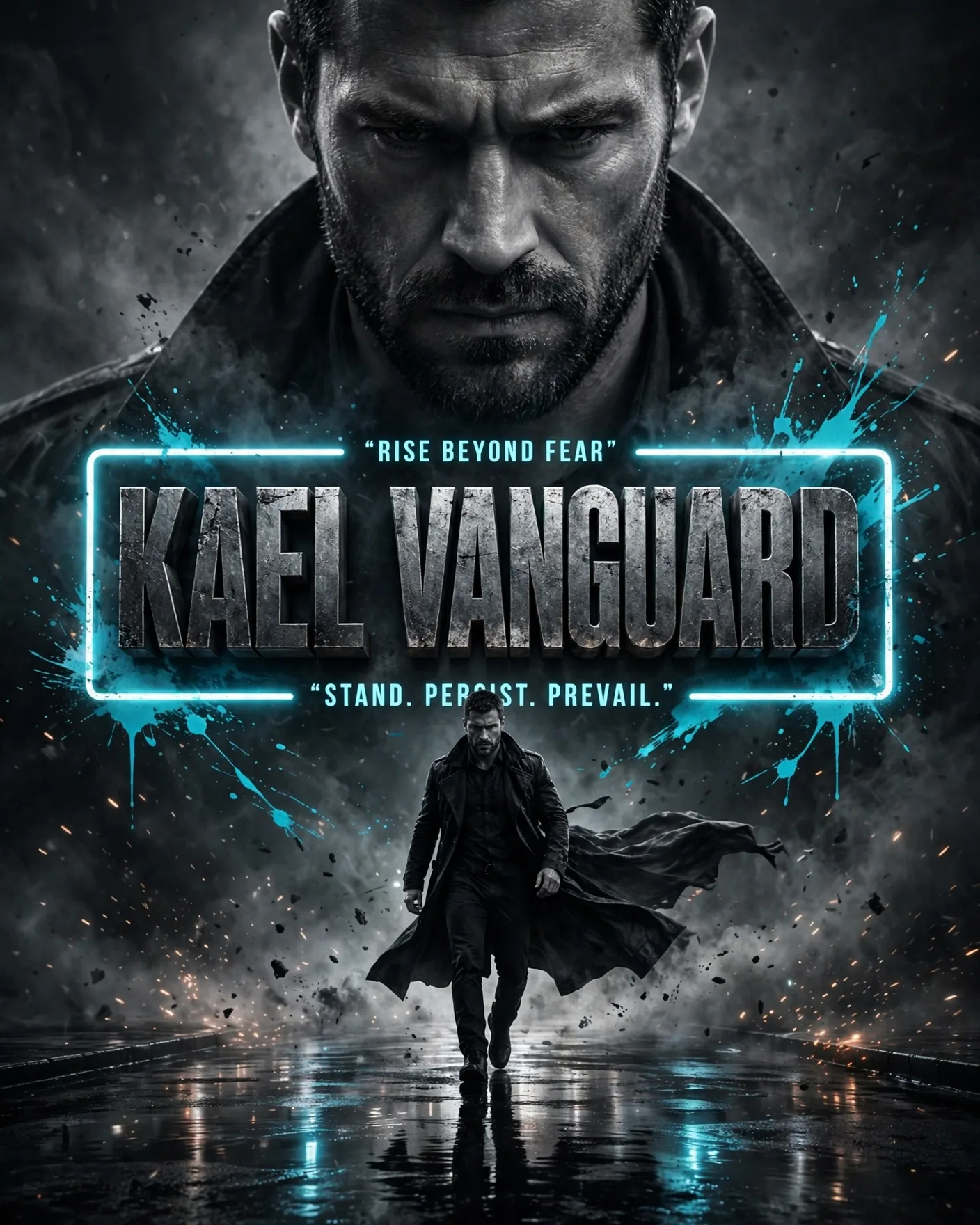
Image models learn pictures, not spelling — so headline text is where they fail most visibly: swapped letters, invented words, warped kerning. The models below are the ones with genuine text-rendering ability, and they fail in different ways. Pick the one whose failure mode you can live with.
The three contenders
| Model | Text rendering | Layout control | Best poster job |
|---|---|---|---|
| ChatGPT Images 2.5 | Strong — precise text, follows complex instructions | Poster/Merch templates, comment-based editing | Posters where the copy must be exact |
| Ideogram | Excellent — built around typography from day one | Strong style-plus-text balance | Type-driven designs, stylized headlines |
| Recraft | Very good — vector-friendly, design-oriented | Native vector output, brand-style controls | Logos, brand posters, print-ready design |
Simple rule: if the headline must be letter-perfect, start with ChatGPT Images or Ideogram and verify every word at full size. If the poster needs clean vector-style graphics and brand consistency, Recraft's design-native output saves a rebuild step.
How to prompt text so it renders
- Put the exact text in quotes, on its own line, separate from the style description
- Keep headlines short — under 8 words renders far more reliably than a paragraph
- Specify placement and hierarchy: "headline at top in large bold condensed type, tagline beneath in smaller italic"
- Name the typeface mood ("bold condensed sans-serif", "elegant serif") rather than a real font name
- Ask for flat, front-on text — perspective and curvature multiply errors
A minimalist movie poster. At the top, large bold condensed white text reads exactly: 'SILENT HARBOR'. Beneath it, smaller italic text reads: 'a film about the sea'. Dark teal background, single lighthouse silhouette, no other text anywhere.
When to fix text by hand
For client work, treat AI text as a layout draft: generate the composition, then re-set the headline in a design tool. Ten minutes of manual typesetting beats twenty regeneration attempts — and it is the only way to guarantee kerning, alignment, and brand fonts.
Frequently Asked Questions
Which model is best for poster text overall?
ChatGPT Images 2.5 and Ideogram are the two strongest for accurate rendered text; Recraft leads for vector-style, design-system poster work. The right pick depends on whether exact copy or brand-ready vector graphics matters more for your job.
Why does my poster text come out misspelled?
Usually one of three causes: the headline is too long, the text is competing with a busy background, or the text is rendered at an angle or in perspective. Shorten the copy, simplify the background, and keep text flat and front-on.
Can AI models render small text like disclaimers?
Unreliably. Small text is the first thing to degrade. Render the poster without the fine print, then add disclaimers, URLs, and legal lines manually in a design tool.
Should I use a real font name in the prompt?
Describe the typeface mood instead ("bold condensed sans-serif"). Real font names are inconsistently honored and can pull in licensed typeface associations you do not want; the mood description gives the model room to render clean letterforms.
Is it faster to just design the poster myself?
For layout and imagery, AI is usually faster. For the typography itself, manual typesetting wins on reliability. The efficient workflow is hybrid: AI for composition and visuals, your design tool for the final text.