





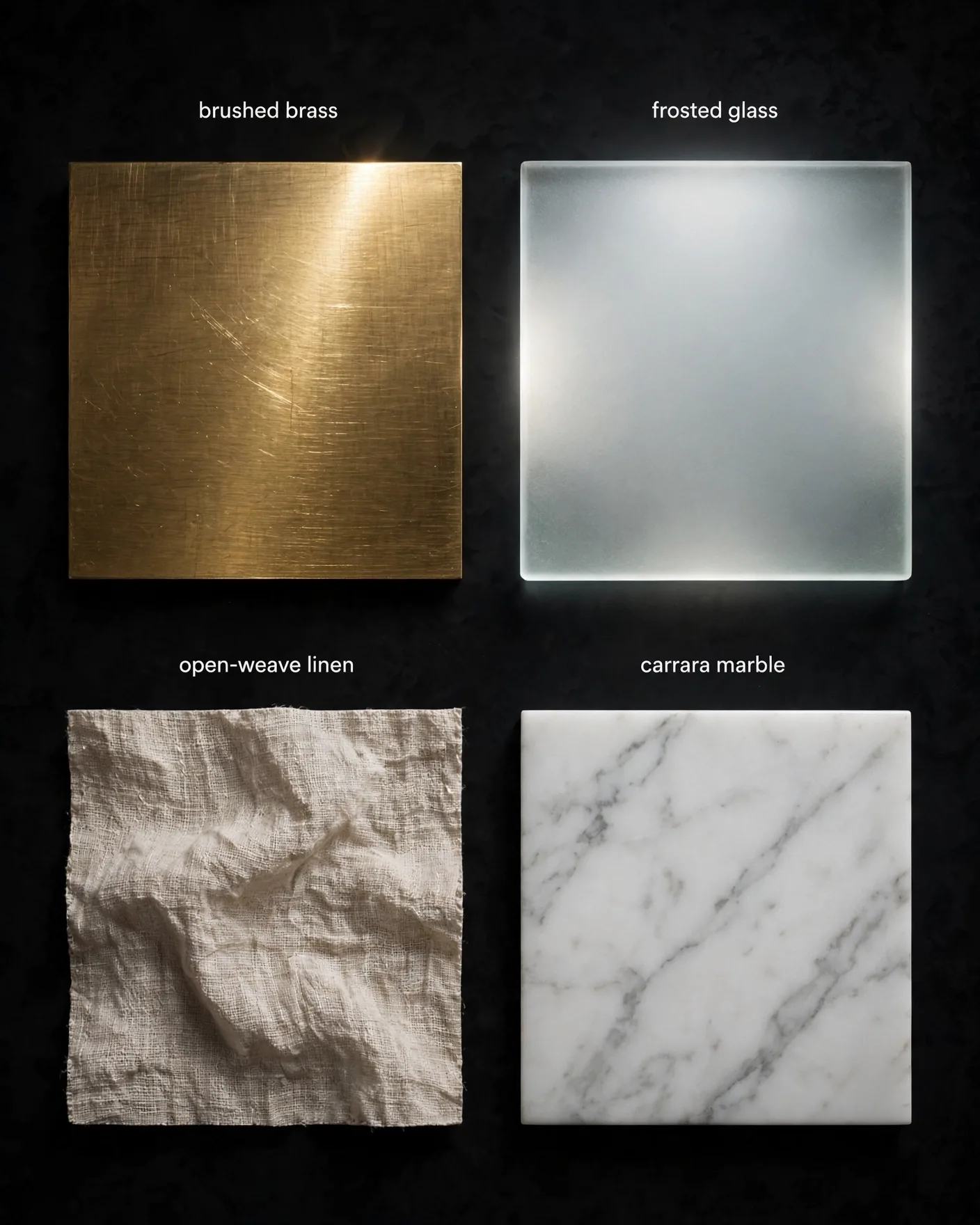
Why "Realistic" Fails at Materials
When a prompt says "realistic metal," the model has to guess which metal — and it usually guesses wrong, landing on a generic chrome-ish plastic. Materials are the highest-density information in a photograph: weave, finish, grain, wear, and the way light behaves on the surface. Name the material precisely and you hand the model a complete rendering recipe; stay vague and you get the default smooth CG look. The fix is vocabulary, not adjectives.
The Fabric Family: Weave, Sheen, Weight
- Linen: "open-weave linen, visible slubs, matte, wrinkled naturally"
- Raw silk: "slubbed raw silk, soft sheen, fluid drape"
- Boucle: "looped boucle yarn, nubby texture, cozy weight"
- Crushed velvet: "crushed velvet, directional pile, deep light absorption"
- Selvedge denim: "selvedge denim, diagonal twill, white edge ID, rigid"
- Technical nylon: "ripstop nylon, matte, slight sheen on folds"
The Metal Family: Finish Determines Reflection
Never write "metal" alone — write the finish, because the finish IS the reflection behavior. Brushed aluminum ("fine concentric machining lines, satin") scatters light softly; polished chrome ("mirror finish, sharp reflections") throws it back hard; sandblasted steel ("fine matte grain, soft glow") diffuses it; patinated copper ("verdigris in recesses, warm highlights on raised areas") tells an age story; liquid chrome ("flowing mercury, distorted mirror reflections") reads as futuristic. Pair every metal with its light behavior: specular highlight, soft sheen, or diffused glow.
Glass, Crystal & Transparent Surfaces
- Frosted glass: "sandblasted, diffused transmission, soft glow behind"
- Borosilicate: "crystal-clear, thin walls, sharp caustic refractions"
- Cut crystal: "faceted, prismatic dispersion, rainbow edge fire"
- Smoked acrylic: "tinted gray, glossy, deep internal reflections"
- Sell it with refraction words: caustics, dispersion, internal reflection, edge glow
Stone & Hard Surfaces: Name the Stone
"Stone texture" gives you gray noise. "Carrara marble with soft gray veining" gives you Carrara marble. Travertine ("pitted, linear voids, honed matte"), honed basalt ("fine grain, deep charcoal, velvety matte"), sandstone ("layered sediment bands, warm ochre") — the stone's name carries its pattern, and the pattern is what reads as real. Same rule for leather: full-grain ("tight pores, rich patina"), pebble grain ("embossed pebbled texture"), nubuck ("velvety buffed surface") — grain plus pliability cues.
The Reusable Material Template
[OBJECT, e.g. a wristwatch] crafted from [MATERIAL FAMILY, NAMED, e.g. brushed brass] with [FINISH/GRAIN DETAIL, e.g. fine circular brushing, satin lacquer] showing [WEAR STATE, e.g. light patina on edges, one fingerprint smudge] interacting with [LIGHT, e.g. warm side light raking across the surface, sharp specular highlight along the bezel] — no plastic, no waxy finish, no overly smooth CG look
| Family | Vague (bad) | Named (good) |
|---|---|---|
| Fabric | realistic cloth | open-weave linen, visible slubs |
| Metal | shiny metal | brushed brass, fine circular brushing |
| Glass | transparent glass | borosilicate, sharp caustic refractions |
| Stone | stone texture | Carrara marble, soft gray veining |
| Leather | leather material | full-grain leather, tight pores |
Frequently Asked Questions
Why do my AI images look plastic even when I write "photorealistic"?
Because "photorealistic" describes the overall render, not the surfaces. Plastic look comes from unspecified materials — the model defaults to smooth CG surfaces. Name the exact material, finish, grain, and one imperfection, and the plastic look disappears.
What is the single highest-leverage material trick?
Naming the finish instead of the material family. "Brushed aluminum with fine machining lines" beats "realistic metal" because the finish determines the reflection behavior — and reflections are what the eye reads as real.
How do I prompt glass and transparent materials?
Use refraction vocabulary: caustics, dispersion, internal reflection, edge glow — plus the specific type (frosted, borosilicate, cut crystal, smoked acrylic). Refraction words sell transparency far better than "clear" or "see-through."
Should I add imperfections to product shots?
Yes — one subtle imperfection per material (a fingerprint on metal, dust on matte, a wrinkle in linen). Total perfection reads as CG; a single honest flaw reads as photographed. Keep it subtle for luxury work.
What is the reusable material prompt template?
[Object] + [material family, named precisely] + [finish/grain detail] + [wear state] + [light interaction] + a negative-material line ("no plastic, no waxy, no overly smooth"). Fill all five slots every time.