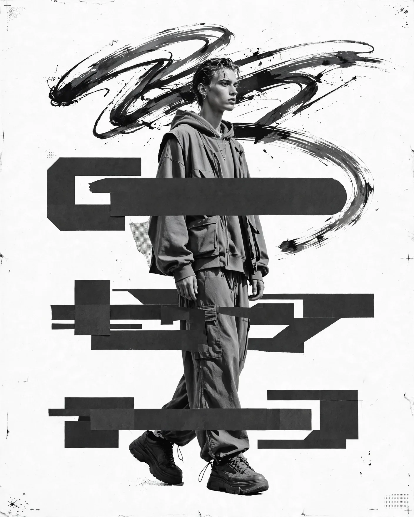


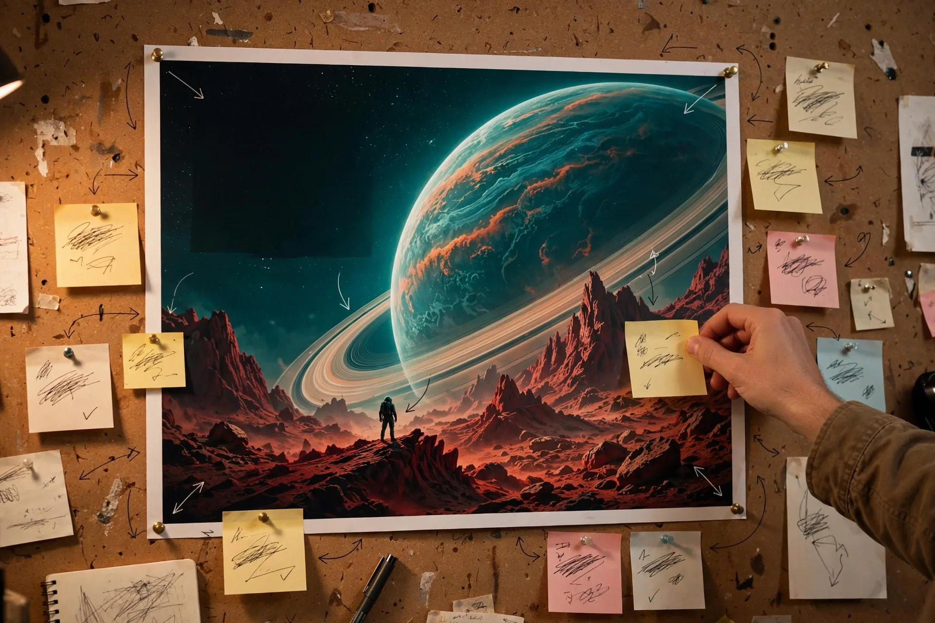
A movie poster is a layout problem, not just an image
Great posters work because of structure: a dominant key visual, a headline title in the right visual weight, a tagline in a quieter zone, and the famous billing block at the bottom. AI image models are excellent at the key art but sloppy with typography — so your prompt must describe the layout zones explicitly, keep text minimal, and accept that you'll fix titles in a design tool afterward.
The 6 zones every poster prompt needs
- Key visual: the single dominant image or character moment
- Genre lighting: horror = cold desaturated; romance = warm golden; sci-fi = neon/rim light
- Title zone: reserve the top or lower third, describe the title treatment
- Tagline: one short line in a quiet area
- Cast hierarchy: biggest face = biggest billing
- Billing block: "tiny condensed credit text block along the bottom edge"
Genre formulas that actually work
| Genre | Lighting and palette | Composition |
|---|---|---|
| Sci-fi epic | Teal-orange grade, volumetric light, lens flare | Lone figure against massive structure, extreme scale contrast |
| Horror | Cold blue-green, hard shadows, fog | Face half-lit in darkness, negative space |
| Romantic drama | Golden-hour warmth, soft bloom | Two figures close, shallow depth of field |
| Action blockbuster | High contrast, motion blur, orange explosions | Dynamic diagonal composition, debris in air |
| Prestige drama | Muted natural light, film grain | Centered portrait, lots of headroom |
Title and tagline: prompt less, design more
Current image models still garble poster text more often than not. The winning workflow: prompt the artwork with a placeholder zone ("large empty dark area at top for title text"), generate, then typeset the actual title and billing block in a design tool. Your prompt should say "no readable text" or "placeholder typography" to stop the model from inventing gibberish credits.
Cinematic movie poster key art for a fictional sci-fi epic titled placeholder: a lone astronaut silhouette standing on a crimson alien ridge, facing a colossal ringed planet filling the sky, teal and orange color grade, volumetric god rays, dramatic rim lighting, extreme scale contrast, large dark empty sky area at top reserved for title text, no readable text, tiny condensed placeholder credit block along the bottom edge, IMAX poster composition, ultra-detailed, 2:3 portrait.
Frequently Asked Questions
Why does the AI keep misspelling the movie title?
Image models render text as shapes, not letters — long titles and small credit text garble easily. Keep in-prompt text to zero or one short placeholder word, and add the real title and billing block afterward in a design tool.
What aspect ratio should I use for posters?
2:3 portrait (e.g. 1024x1536) matches the standard one-sheet format. Use 16:9 only for banner/header variants, and 1:1 for social teasers.
How do I get the "blockbuster look"?
Prompt the grade explicitly: teal-and-orange color grade, volumetric lighting, rim light on the subject, shallow depth of field on the key figure, and massive scale contrast (tiny figure, huge environment). Then describe the empty title zone.
Can I use real movie styles as reference?
Describe the style in generic terms ("1980s action one-sheet style", "minimalist A24-style poster") rather than naming real films, studios, or actors — you get the aesthetic without the copyright risk.
What's the best prompt order for posters?
Lead with the key visual and genre, then lighting and palette, then composition and layout zones, then text instructions ("no readable text"), then quality tags. Layout zones are what separate amateur from professional results.