A thumbnail has one job
Nobody reads the description before clicking. The thumbnail is the ad for your video, and it wins or loses in about half a second. That means your AI prompt needs to produce something bold, simple, and readable at phone-screen size — not a detailed illustration.
Thumbnail anatomy: what to describe in your prompt
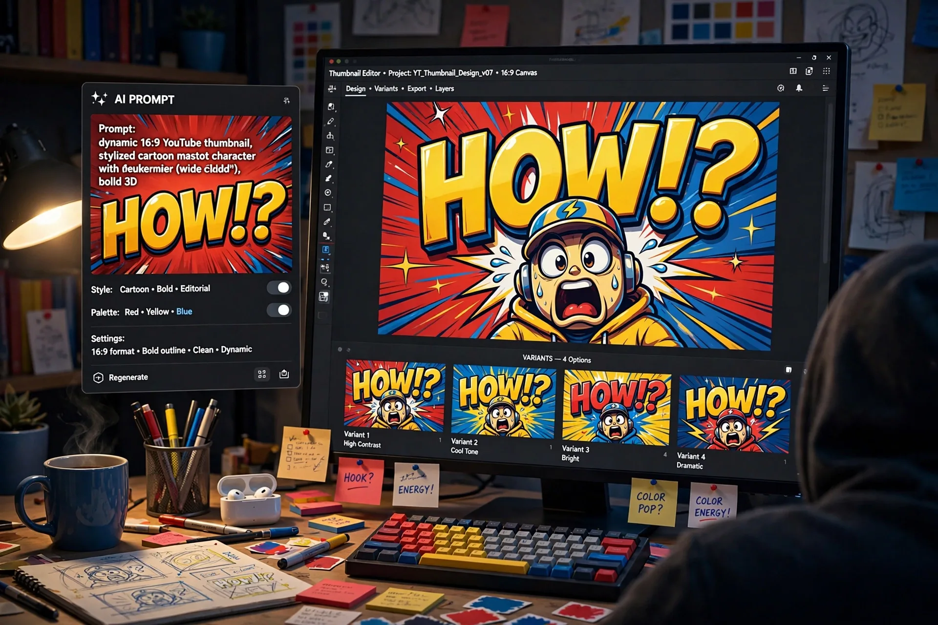
Every high-performing thumbnail shares the same bones. Bake these into your prompt's subject description: a maximum of 2–3 bold words in huge, high-contrast type; one expressive emotion — shock, curiosity, or a clear before/after; the subject placed on the right third so the text has breathing room; a limited palette of 3 colors max; and a curiosity gap that makes the viewer need to know more.
- 2–3 bold words, huge and high-contrast — never tiny text.
- One strong emotion: shock, curiosity, excitement, or before/after.
- Subject on the right third, text space on the left.
- Maximum 3 colors in the whole composition.
- A curiosity gap: a question the viewer can't leave unanswered.
The prompt formula
Structure your thumbnail prompts like this: style anchor + subject + emotion + background + text overlay placement + 16:9 + lighting and contrast cues. A style anchor like "bold MrBeast-style YouTube thumbnail" sets the visual language instantly; the rest pins down the composition.
Bold MrBeast-style YouTube thumbnail, 16:9. A young man with a shocked expression pointing at a giant glowing robot dog, positioned on the right third. Left side: empty dark blue space with huge yellow 3D text reading "IT'S ALIVE". Ultra high contrast, saturated colors, clean composition, readable at small size.
Prompting for the text overlay
AI image models still mangle text, so be explicit: state the exact words, the placement, the size ("huge, fills half the frame"), the style ("thick 3D yellow letters with black outline"). Keep it to 2–3 words — models fail more often with longer phrases. Then generate multiple variants and pick the one where the text is actually correct.
Keeping a consistent channel style
When you prompt a series, repeat the same style anchor and palette across every thumbnail ("same bold style, red-black-gold palette, same layout"). Consistency builds a recognizable channel identity, and viewers start spotting your videos before they read the title.
Common mistakes that kill clicks
- Tiny text that vanishes at phone-screen size.
- Cluttered backgrounds that fight the subject for attention.
- More than one focal point — the eye doesn't know where to look.
- Generic stock-photo look with no emotion or curiosity gap.
- Colors so muted the thumbnail blends into the feed.
- Long phrases the AI model renders as gibberish.
Your workflow, step by step
1) Write the prompt using the formula above. 2) Generate 3+ variants with different emotions or text. 3) Zoom out to thumbnail size and check readability — if you can't read the text or feel the emotion at 120px wide, regenerate. 4) Test two finalists with YouTube's thumbnail testing. 5) Save the winning prompt as your channel template and reuse the style anchor for every video.
Frequently Asked Questions
What aspect ratio should I ask for in a thumbnail prompt?
Always 16:9 — YouTube thumbnails display at 1280x720. Write "16:9" explicitly in your prompt so the composition is framed correctly.
How many words should the thumbnail text have?
Two or three, max. AI models render short phrases far more reliably than sentences, and viewers can read 2–3 words in a fraction of a second. Longer text also crowds out the image.
Why do my thumbnails look blurry on phones?
You're probably not checking at preview size. Always shrink your generated image to about 120 pixels wide before judging it — that's roughly how viewers see it in the feed. If the text isn't readable there, regenerate with bigger, simpler text.
Should I make the AI generate the text, or add it myself?
AI text is much better than it used to be, but it's still the failure point. For final publishing, many creators generate the background and subject with AI, then add the text overlay in an editor for perfect control. For speed, AI-generated text in short phrases works well — always verify spelling.
What colors get the most clicks?
There's no universal winner, but the pattern is clear: high contrast, saturated colors, and consistency. Red, yellow, and blue dominate the top-performing thumbnails because they pop against YouTube's dark and light modes. Pick a 3-color palette and stick with it across your channel.
Related Prompts
Vector Fashion Editorial Illustration Portrait Editable AI Prompt
ChatGPT
Street Dance Fashion Illustration Editorial Editable AI Prompt
ChatGPT
Illustrated Athlete Giant Sneaker Mustard Poster Ad Editable AI Prompt
ChatGPT